

Excel Dashboards Made Easy | Create Stunning Charts & Data Visualizations

Introduction
In today’s data-driven world, the ability to analyze and visualize information efficiently is a game-changer. Excel remains one of the most powerful tools for data analysis, offering a variety of charts and dashboards that help transform raw data into actionable insights. Whether you are a business analyst, student, or professional, mastering Excel charts and dashboards allows you to quickly identify trends, monitor performance, and make smarter decisions.
With over 750 million users worldwide, Excel’s visualization capabilities are constantly evolving. From simple bar and line charts to interactive dashboards, the options are endless. In this article, we’ll explore essential techniques, common mistakes to avoid, and practical methods to create dashboards that impress stakeholders and deliver insights effectively.
Features of Excel Charts and Dashboards
Excel charts and dashboards come with an array of features designed to make data visualization simple yet powerful. Here are some key features:
1. Variety of Chart Types
Excel offers numerous chart types, including column, bar, line, pie, scatter, area, and combo charts. Each type serves a specific purpose, making it easy to highlight trends, compare categories, or show progress over time.
2. Interactive Dashboards
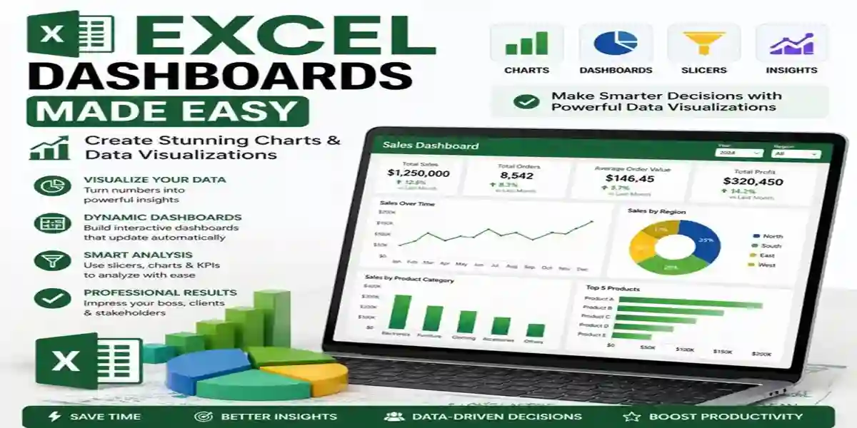
Excel dashboards allow users to combine multiple charts, tables, and visual elements in a single view. Features like slicers, pivot tables, and conditional formatting make dashboards interactive, enabling users to filter data dynamically.
3. Conditional Formatting
Conditional formatting highlights critical data points automatically based on specific criteria. For example, you can color-code sales figures above or below a threshold, making key insights immediately visible.
4. Dynamic Data Updates
Dashboards and charts can be linked to live data sources, so any updates in the raw data automatically reflect in your visualizations. This ensures your analysis remains current and reliable.
5. Customizable Design
Excel allows you to customize chart styles, colors, and labels, making your dashboards visually appealing and easy to understand. Proper use of colors, fonts, and spacing improves readability and engagement.
6. Integration with Power Query and Power Pivot
Advanced users can integrate Excel with Power Query and Power Pivot to handle large datasets efficiently. This integration enables more complex calculations and advanced dashboard functionality.
Common Errors and How to Fix Them
Even experienced Excel users can make mistakes when creating charts and dashboards. Identifying and fixing these errors is crucial to ensure your data is accurately represented.
1. Incorrect Data Selection
Error: Selecting wrong rows, columns, or ranges can distort your chart.
Fix: Double-check your data range before creating a chart. Use named ranges for dynamic updates.
2. Overcrowded Dashboards
Error: Too many charts or visual elements can confuse viewers.
Fix: Focus on key metrics only. Group related information and use multiple dashboards if necessary.
3. Misleading Axis Scales
Error: Uneven or inappropriate axis scaling can exaggerate or downplay trends.
Fix: Ensure axis scales are logical and consistent. Consider starting at zero for comparative charts.
4. Poor Color Choices
Error: Colors that are too bright, similar, or clash can reduce clarity.
Fix: Stick to a simple color palette. Use contrasting colors to highlight important data points.
5. Static Data
Error: Charts not linked to data sources become outdated.
Fix: Link charts to dynamic ranges or pivot tables to ensure they update automatically when data changes.
6. Ignoring Data Labels
Error: Viewers struggle to interpret charts without clear labels.
Fix: Add meaningful titles, axis labels, and data labels for clarity.
Methods to Activate Excel Charts and Dashboards
Creating effective charts and dashboards requires a systematic approach. Below are methods to activate Excel’s visualization capabilities:
Step 1: Prepare Your Data
Clean and organize your data before visualizing it. Remove duplicates, handle missing values, and ensure consistent formatting. Structured data is easier to analyze and prevents errors.
Step 2: Choose the Right Chart
Select a chart type that matches your data and analysis goals. For trends over time, use line charts; for comparisons, use bar or column charts; for proportions, use pie or doughnut charts.
Step 3: Insert Charts
- Highlight your data range.
- Go to the Insert tab.
- Choose the chart type from the Charts group.
- Customize the chart with titles, axis labels, and colors.
Step 4: Create Pivot Tables
Pivot tables summarize large datasets and are the backbone of dynamic dashboards. They allow you to filter, sort, and aggregate data efficiently.
Step 5: Add Interactivity
Use slicers and timeline filters to make your dashboards interactive. Slicers allow viewers to filter data easily, while timelines are ideal for time-based analysis.
Step 6: Apply Conditional Formatting
Highlight key trends, anomalies, or outliers automatically. For example, sales below target can be shown in red, while above-target sales appear in green.
Step 7: Build a Dashboard
Combine charts, pivot tables, and metrics into a single sheet. Arrange them logically, group related elements, and leave enough space for clarity. Test your dashboard for usability and readability.
Step 8: Link Data Sources
For dynamic dashboards, link charts and pivot tables to external data sources or named ranges. This ensures updates are reflected automatically without manual intervention.
Advanced Techniques
- Combo Charts: Combine two chart types, like a line and column chart, to compare trends with totals.
- Sparklines: Tiny charts within a cell to show trends for individual metrics.
- Power Query & Power Pivot: Handle large datasets, create calculated fields, and produce complex dashboards efficiently.
- Interactive Buttons & Macros: Automate dashboard actions like switching views or updating charts with one click.
Conclusion
Excel charts and dashboards are indispensable tools for anyone who wants to analyze data effectively. From simple visualizations to interactive dashboards, mastering Excel’s capabilities allows you to uncover insights, communicate findings clearly, and make informed decisions. Avoid common mistakes, leverage advanced features, and continuously refine your dashboards to stay ahead in analytics. By applying these techniques, you can turn complex data into clear, actionable insights that drive results.
Frequently Asked Questions (FAQ)
A: A chart is a single visual representation of data, while a dashboard combines multiple charts, tables, and metrics to provide a comprehensive view of key information.
A: Use pivot tables, slicers, timelines, and buttons. These elements allow users to filter data and explore metrics dynamically.
A: Yes, you can link dashboards to external data sources, named ranges, or tables so that any updates automatically reflect in your visualizations.
- A: Common mistakes include incorrect data selection, misleading axis scales, poor color choices, overcrowded dashboards, and ignoring data labels.
A: Yes, tools like Power Query, Power Pivot, and macros enhance dashboard functionality, allowing for large datasets, complex calculations, and automation.